
During my time with EVERSANA INTOUCH, I worked as a freelance Art Director and UI Designer on an interactive iPad experience for Imbruvica. The goal was to equip sales representatives with a visually engaging, easy-to-navigate tool that could communicate complex medical data across multiple treatment indications, all while meeting strict pharmaceutical compliance standards.
Client – EVERSANA INTOUCH / Imbruvica
Role - Freelance Art Director & UI Designer
Tools - Sketch, InVision, After Effects (Lottie)
Role - Freelance Art Director & UI Designer
Tools - Sketch, InVision, After Effects (Lottie)
Overview
Imbruvica is a leading therapy used to treat several blood cancers and chronic conditions. The challenge was to create an interactive iPad sales tool that could help representatives deliver clear, compliant, and engaging presentations to healthcare providers across multiple treatment indications.
Problem
The sales team was using traditional static PDFs and needed a more intuitive, dynamic, and visually engaging way to communicate complex medical data and key product messaging—while remaining compliant with pharmaceutical standards and legal requirements.
Original CVA (Core Visual Aid) in PDF Format
Objective
Design a scalable, modular digital tool that would:
• Clearly communicate indication-specific content
• Simplify navigation through clinical data, study designs, and safety information
• Align with brand guidelines and regulatory compliance
• Enhance the effectiveness of sales conversations in the field
My Role
I was brought in as a freelance Art Director and UI Designer. I worked closely with the UX team during the early stages to help define the structure and layout. From there, I led the visual design efforts using Sketch for UI and After Effects with Lottie to create micro-interactions and animated transitions. Prototypes were shared using InVision for user testing and stakeholder feedback.
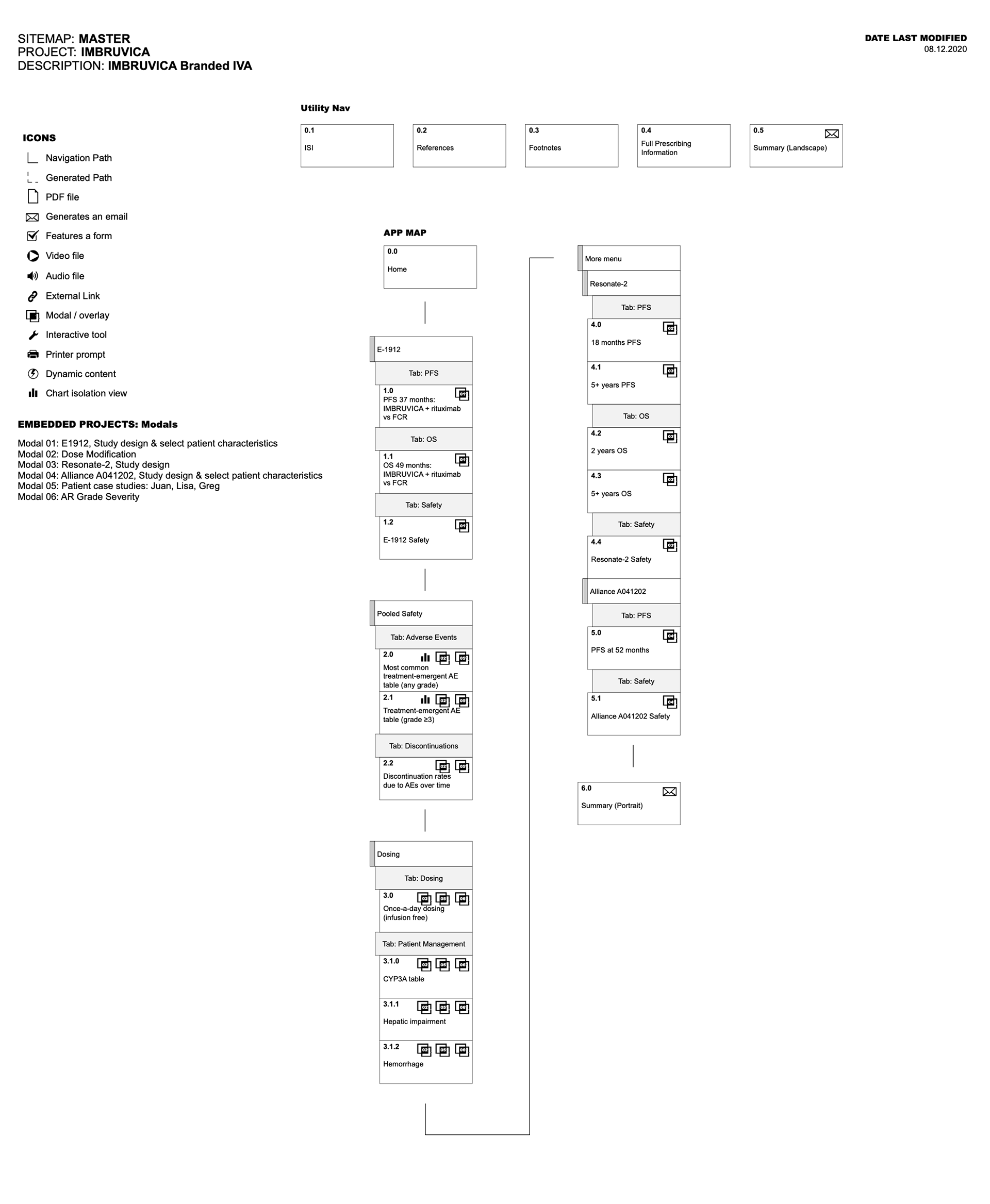
Application Architecture Map
Initial UX Exploration
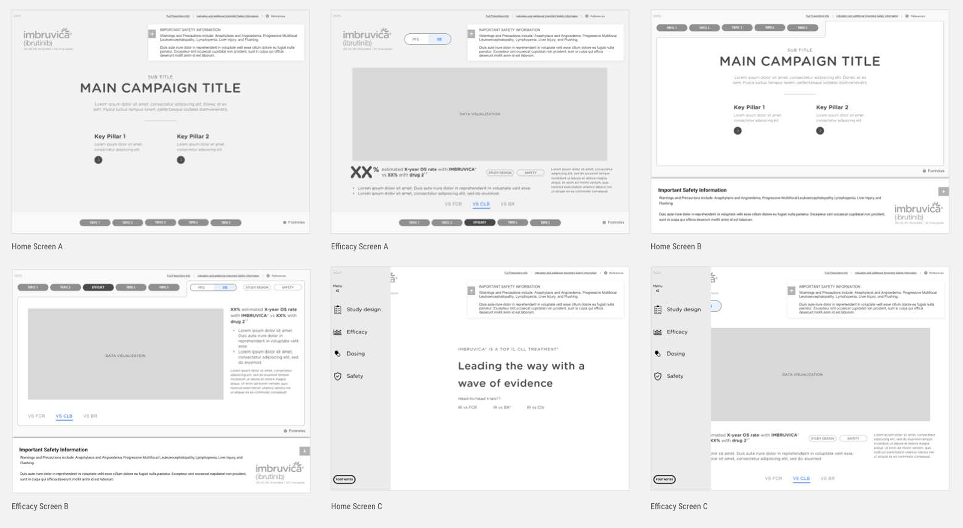
Initial Design Exploration
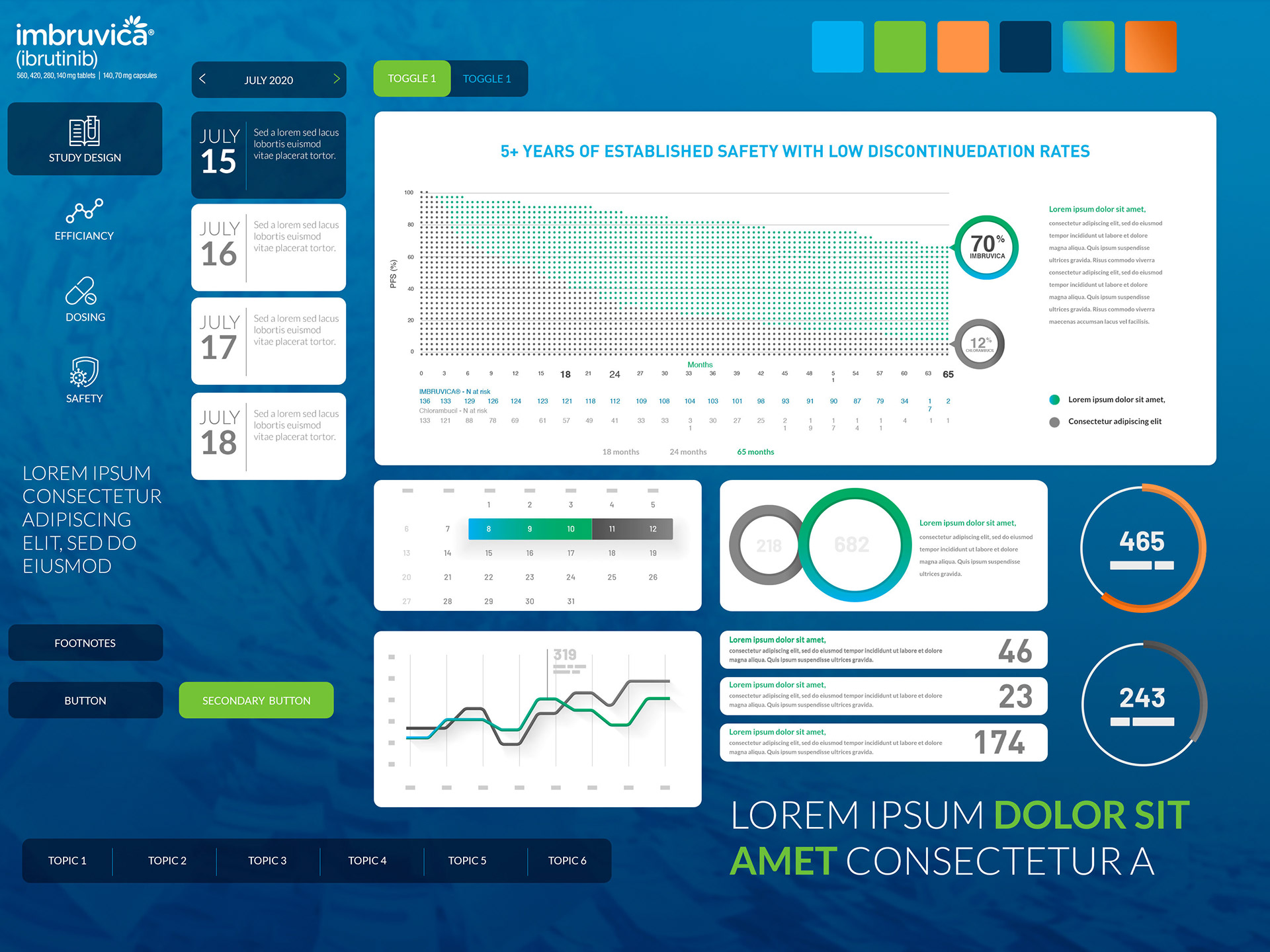
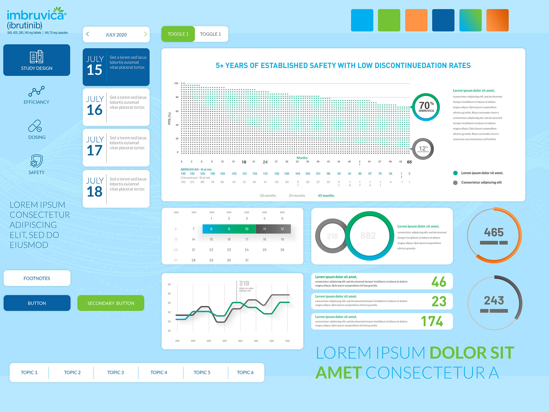
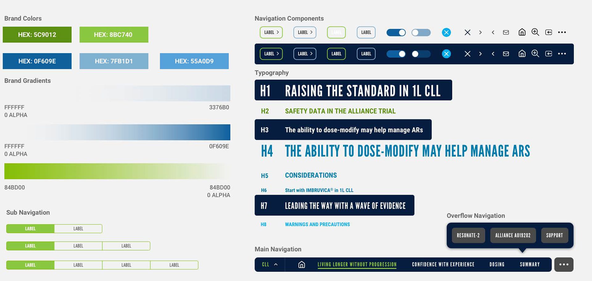
Final App UI System
Result
The final experience was well-received by the sales team—easy to navigate, visually compelling, and effective in the field. The success of the initial launch led to further engagement for additional indications, reinforcing the value of the tool across the sales pipeline.
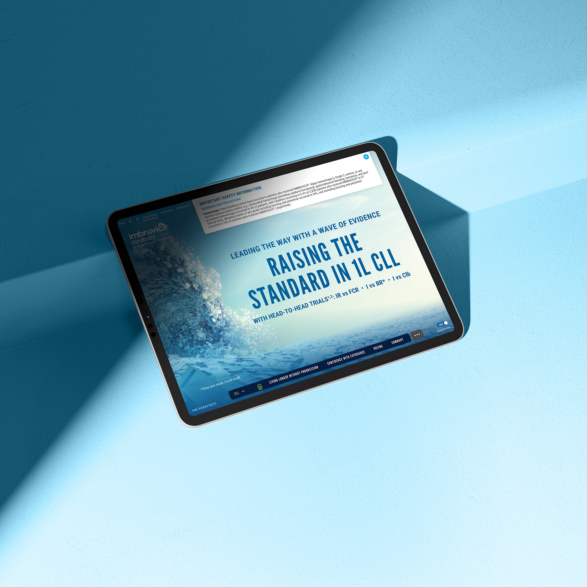
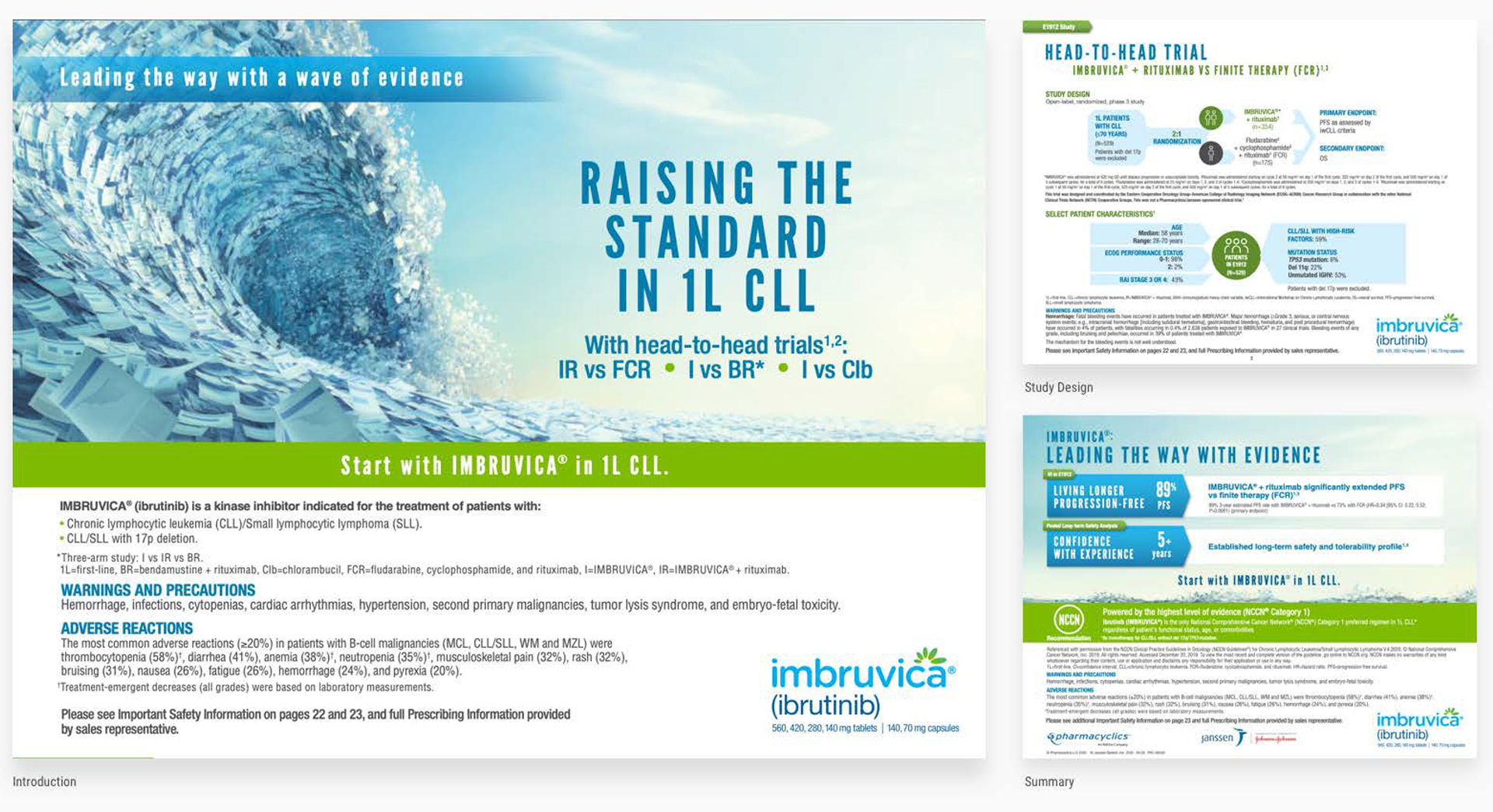
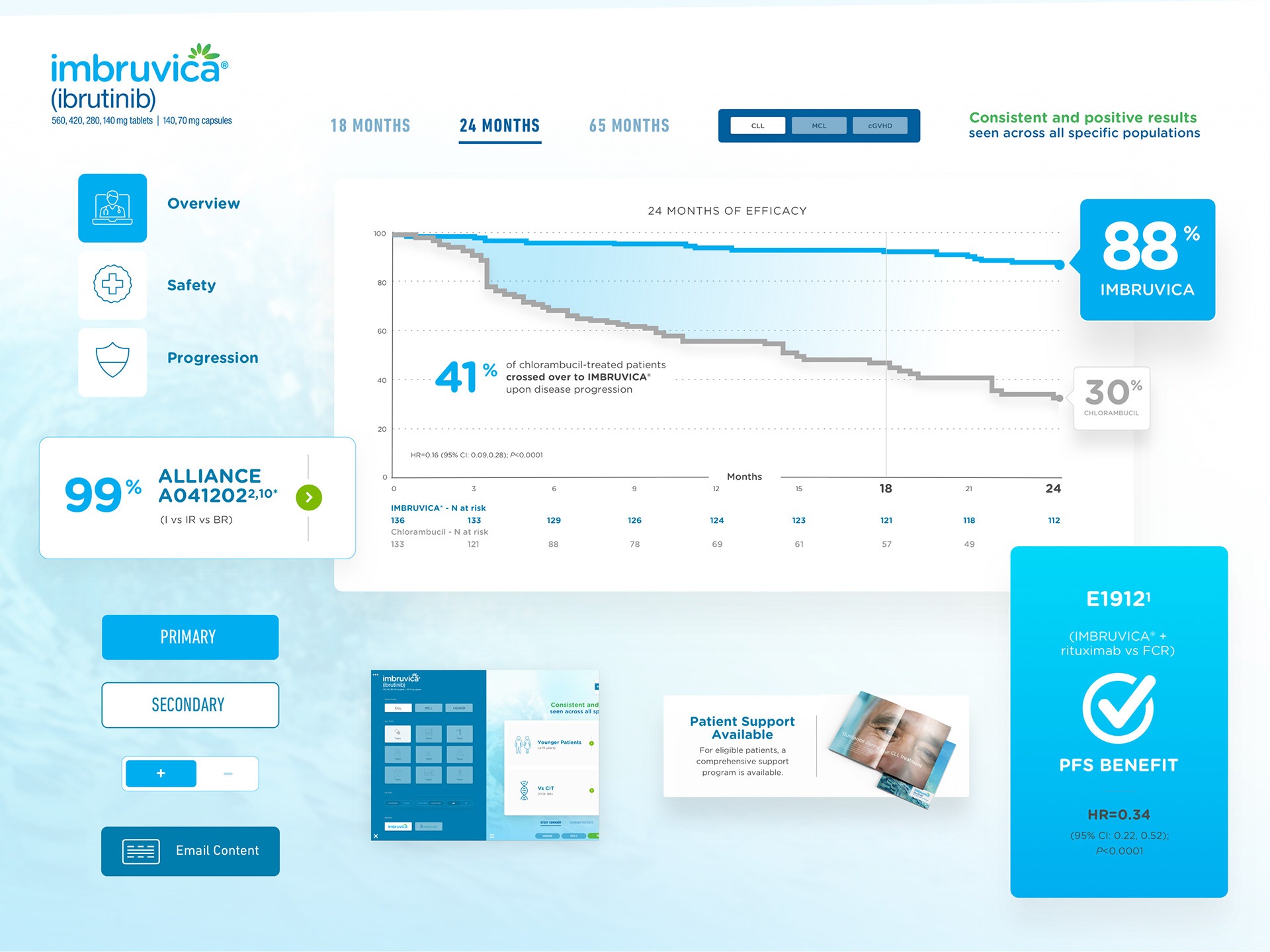
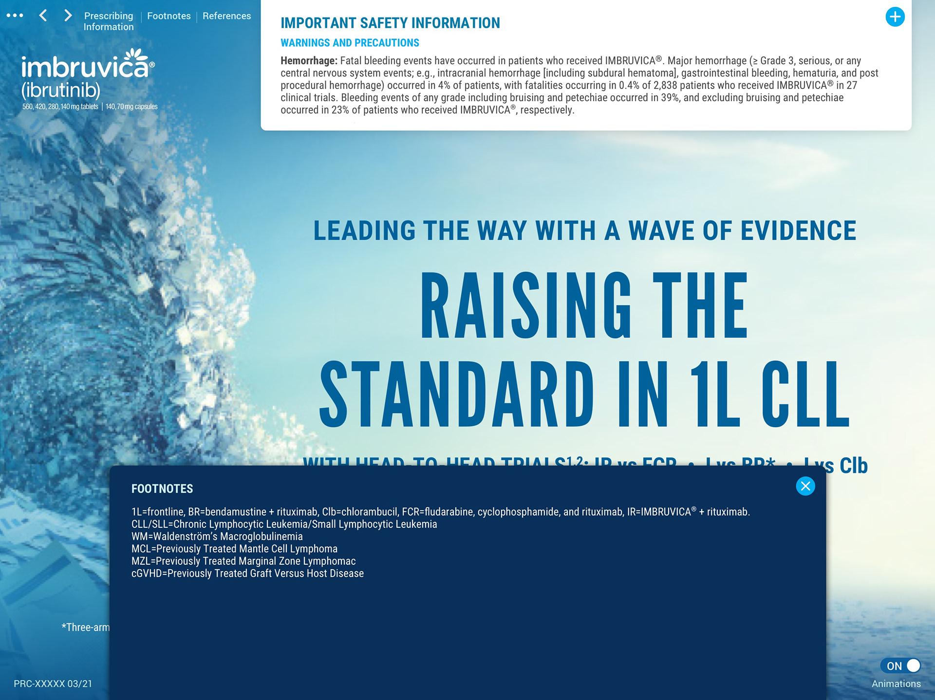
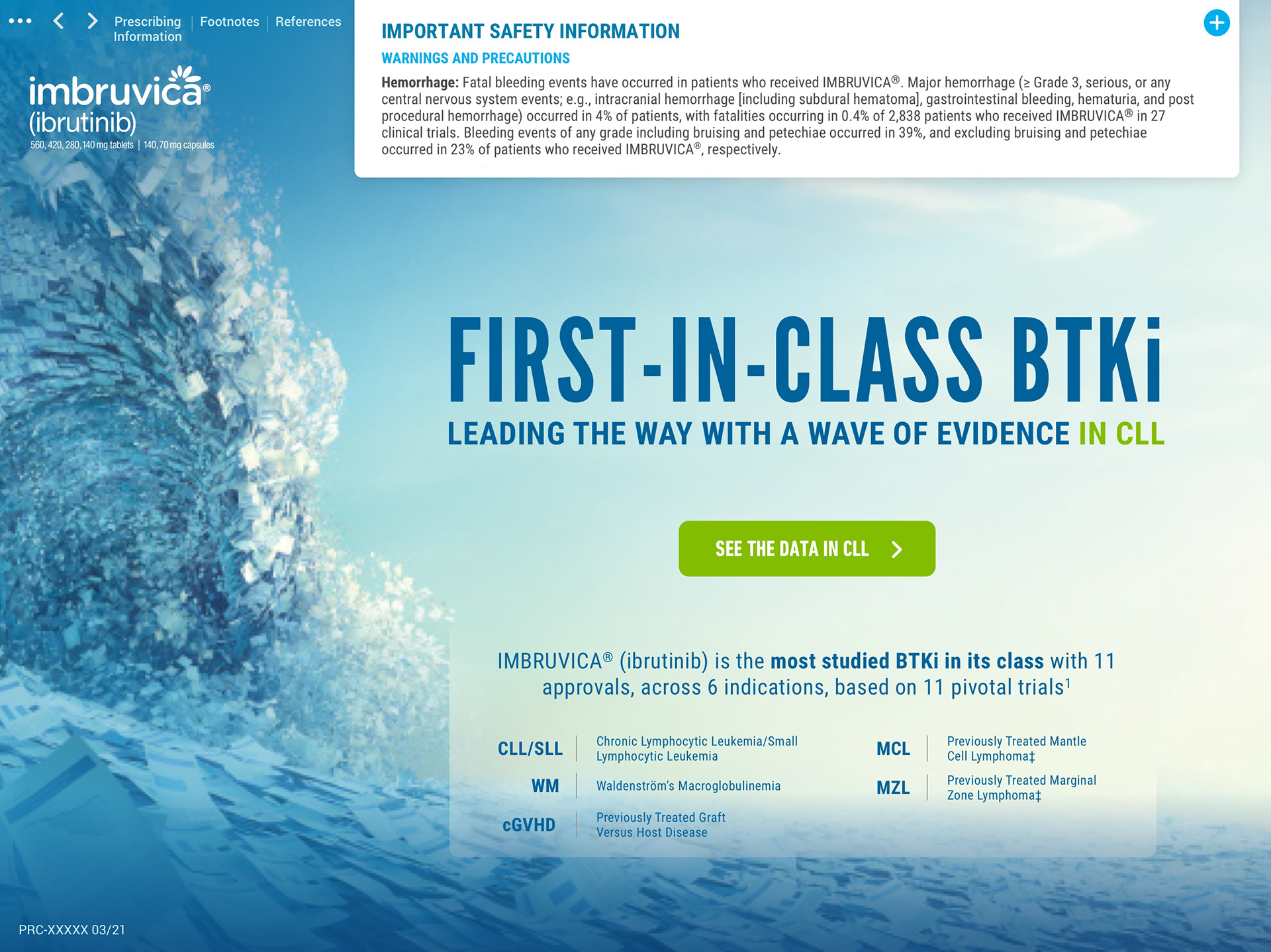
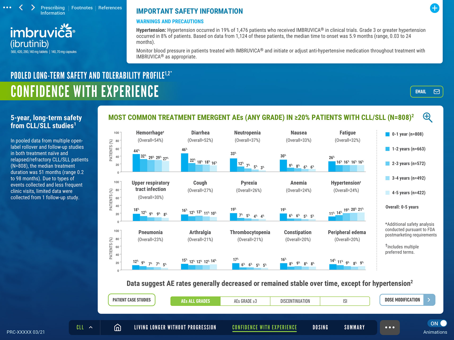
CLL Home Screen
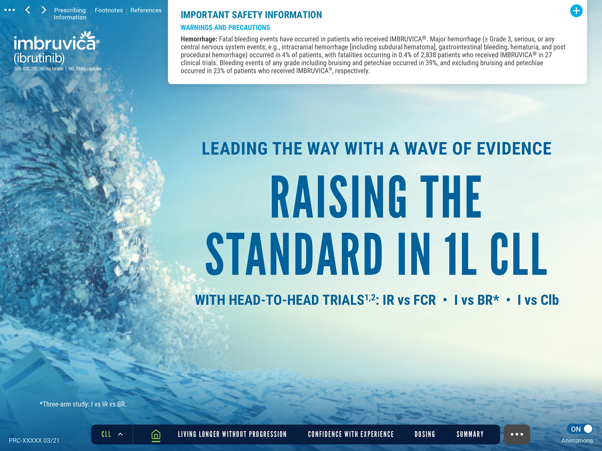
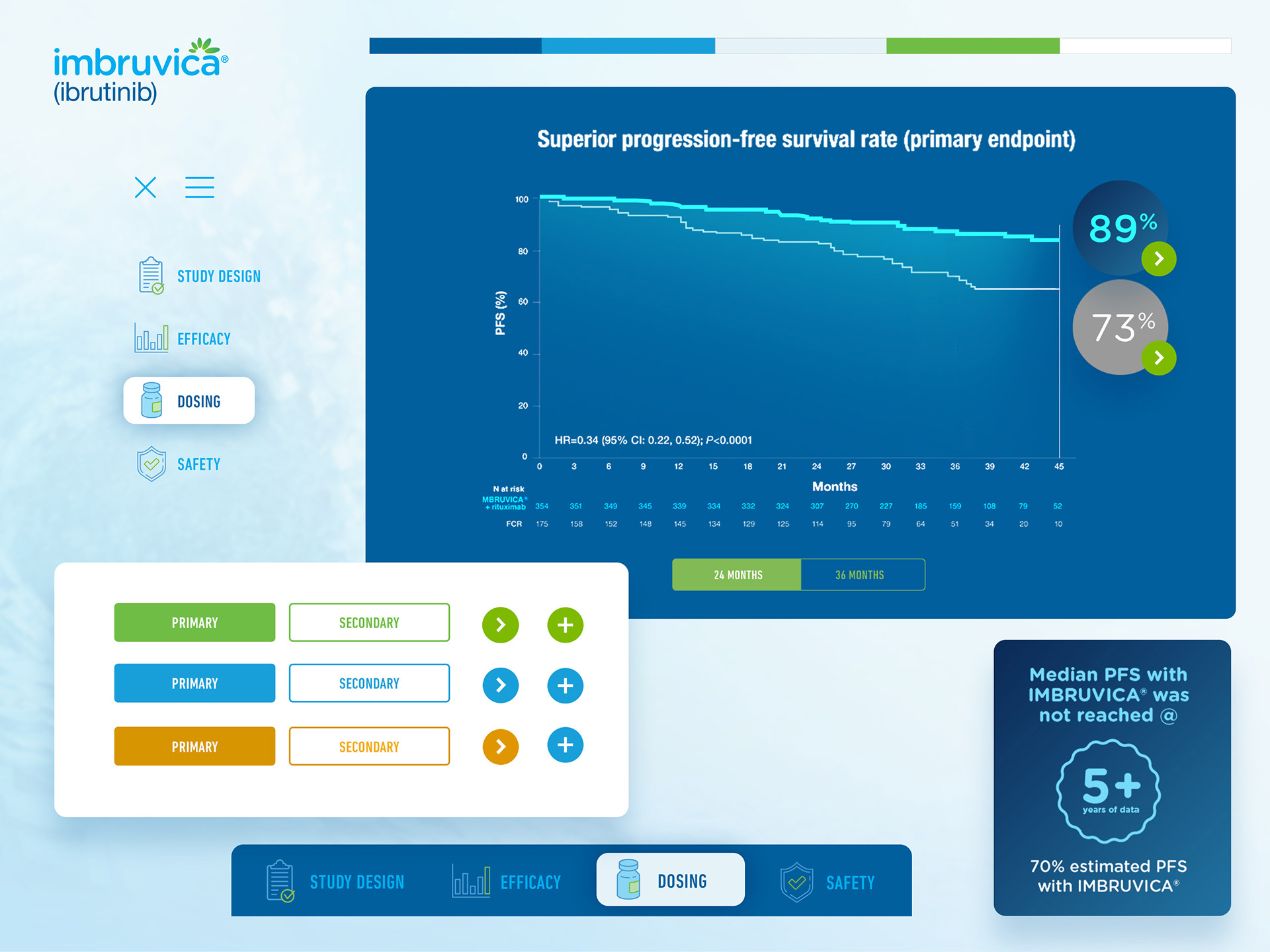
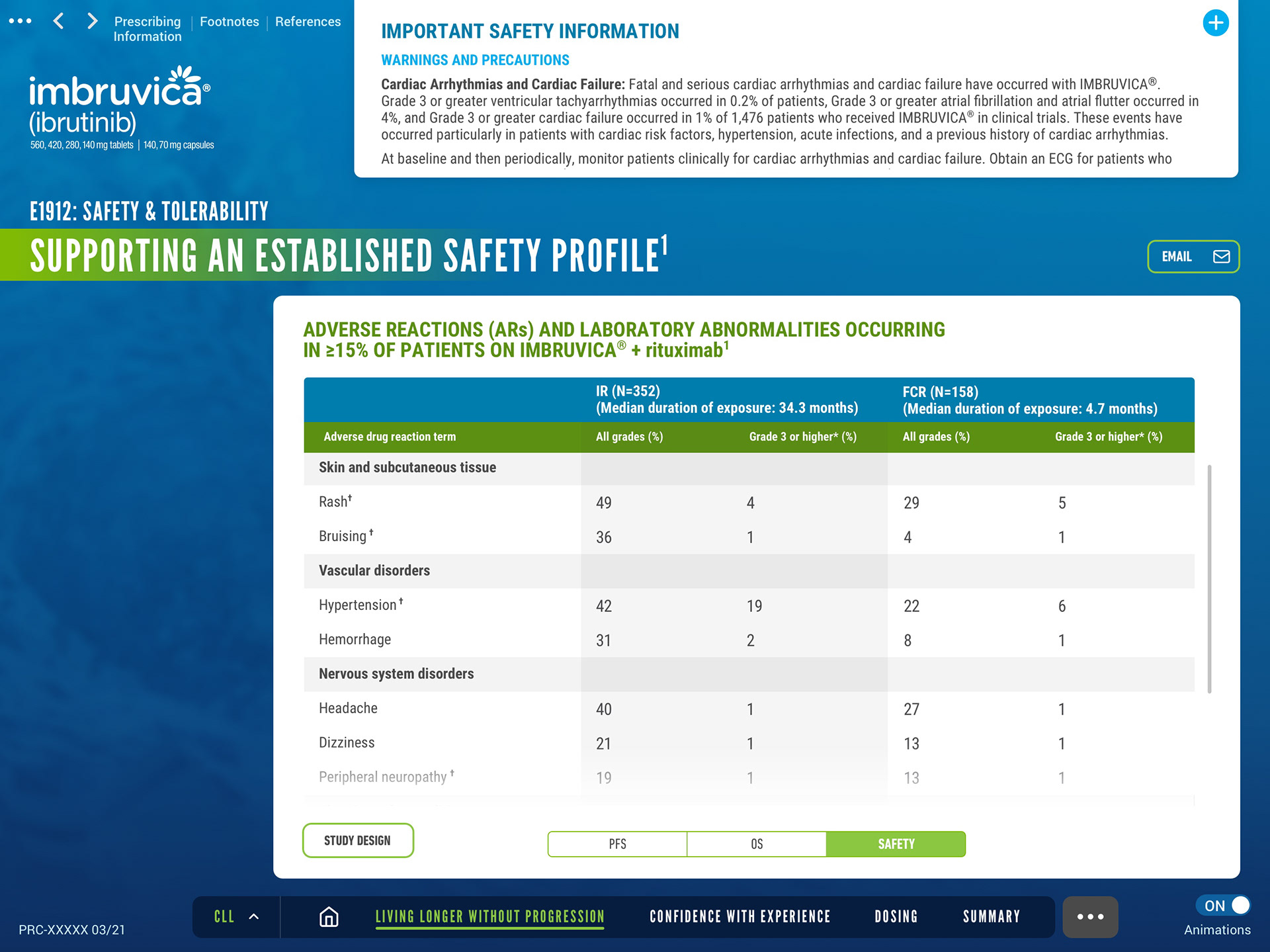
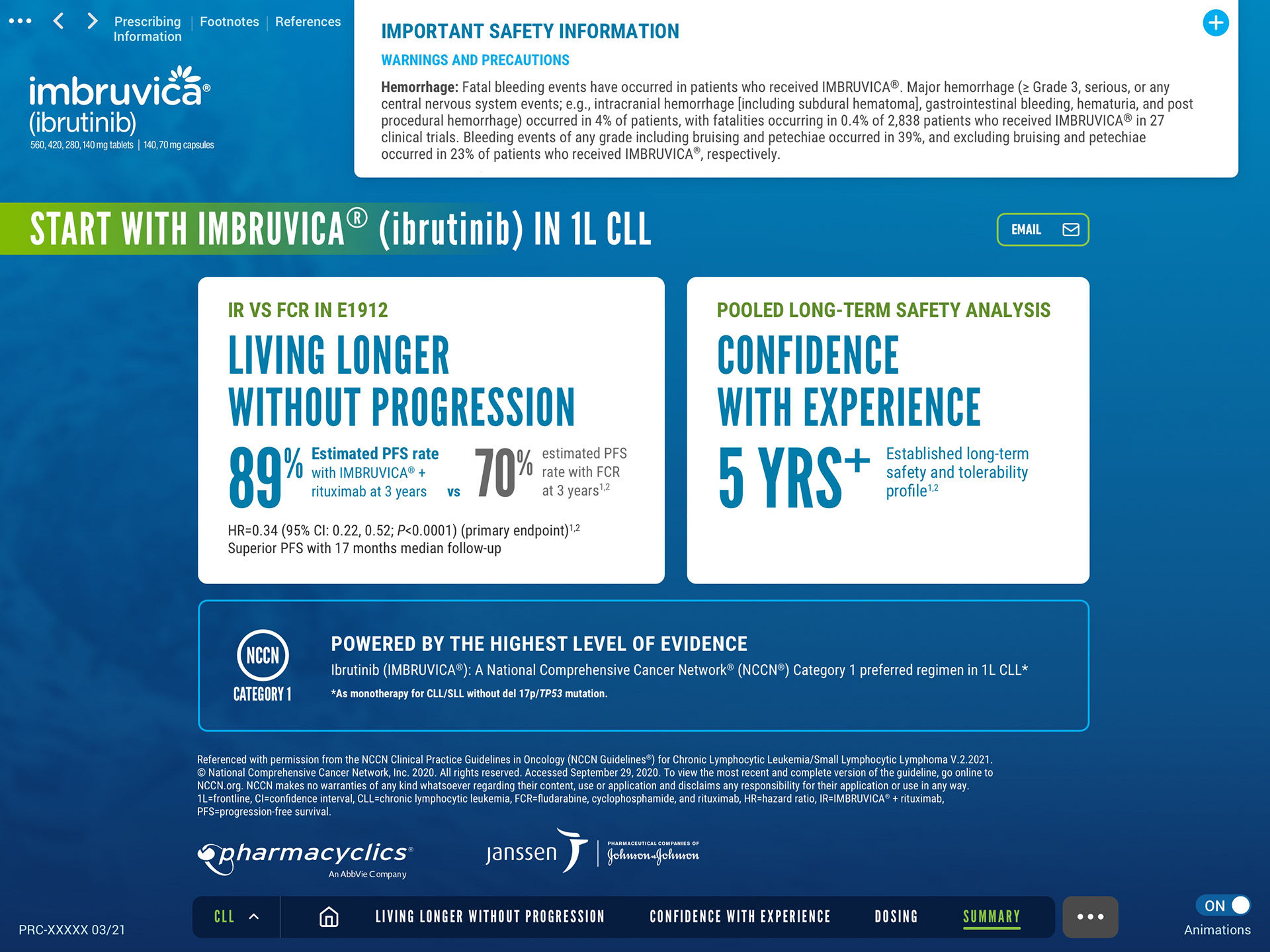
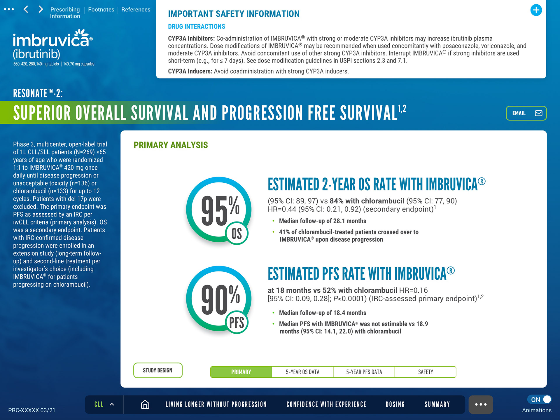
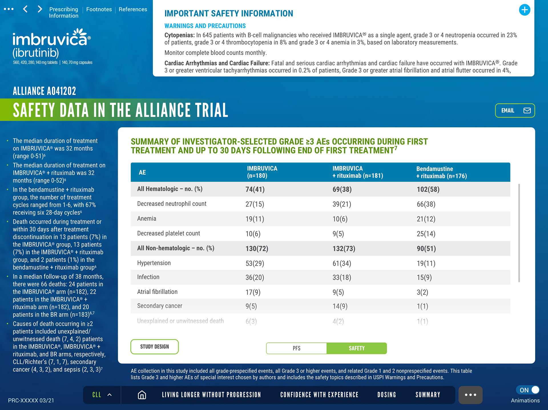
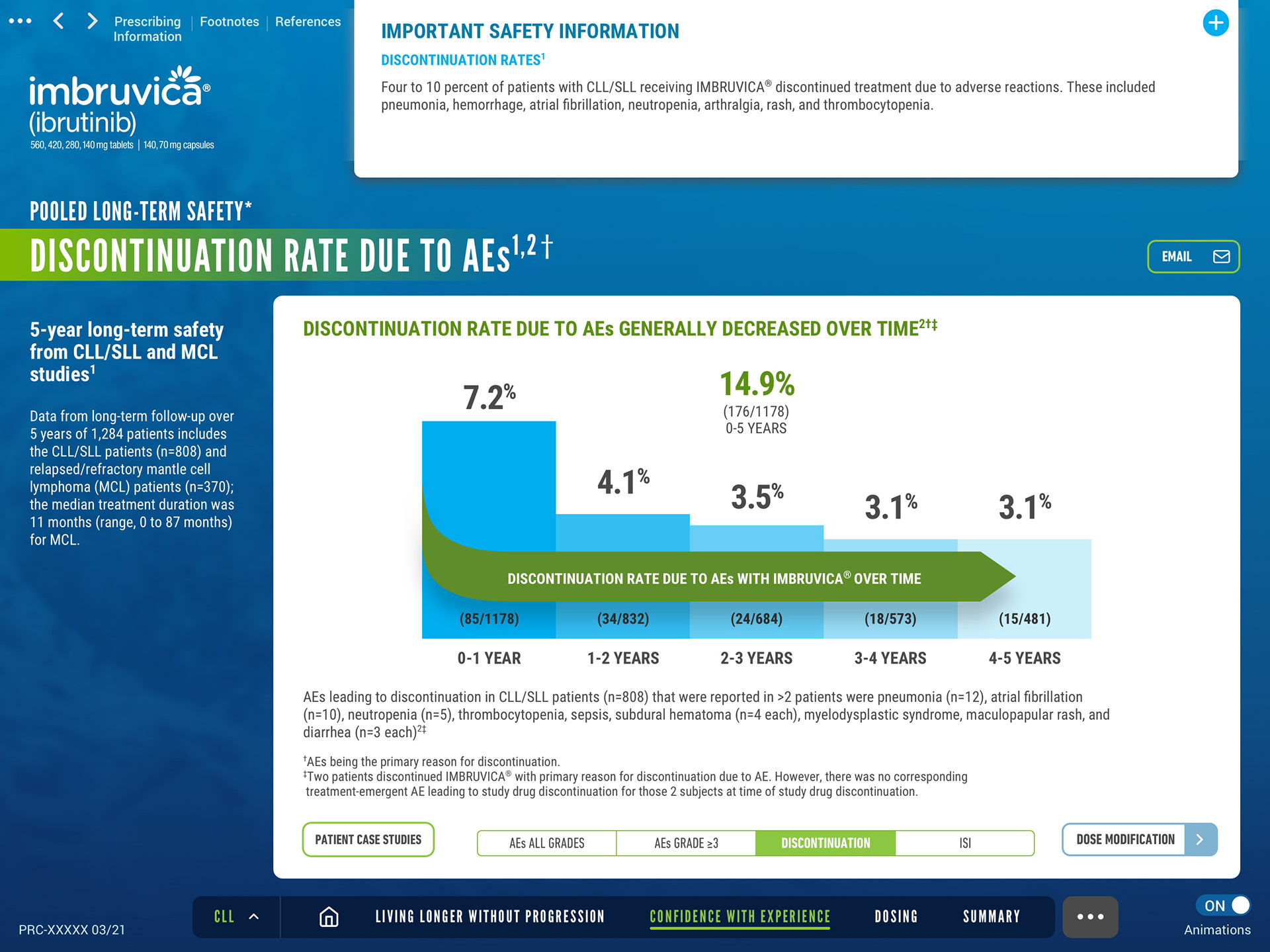
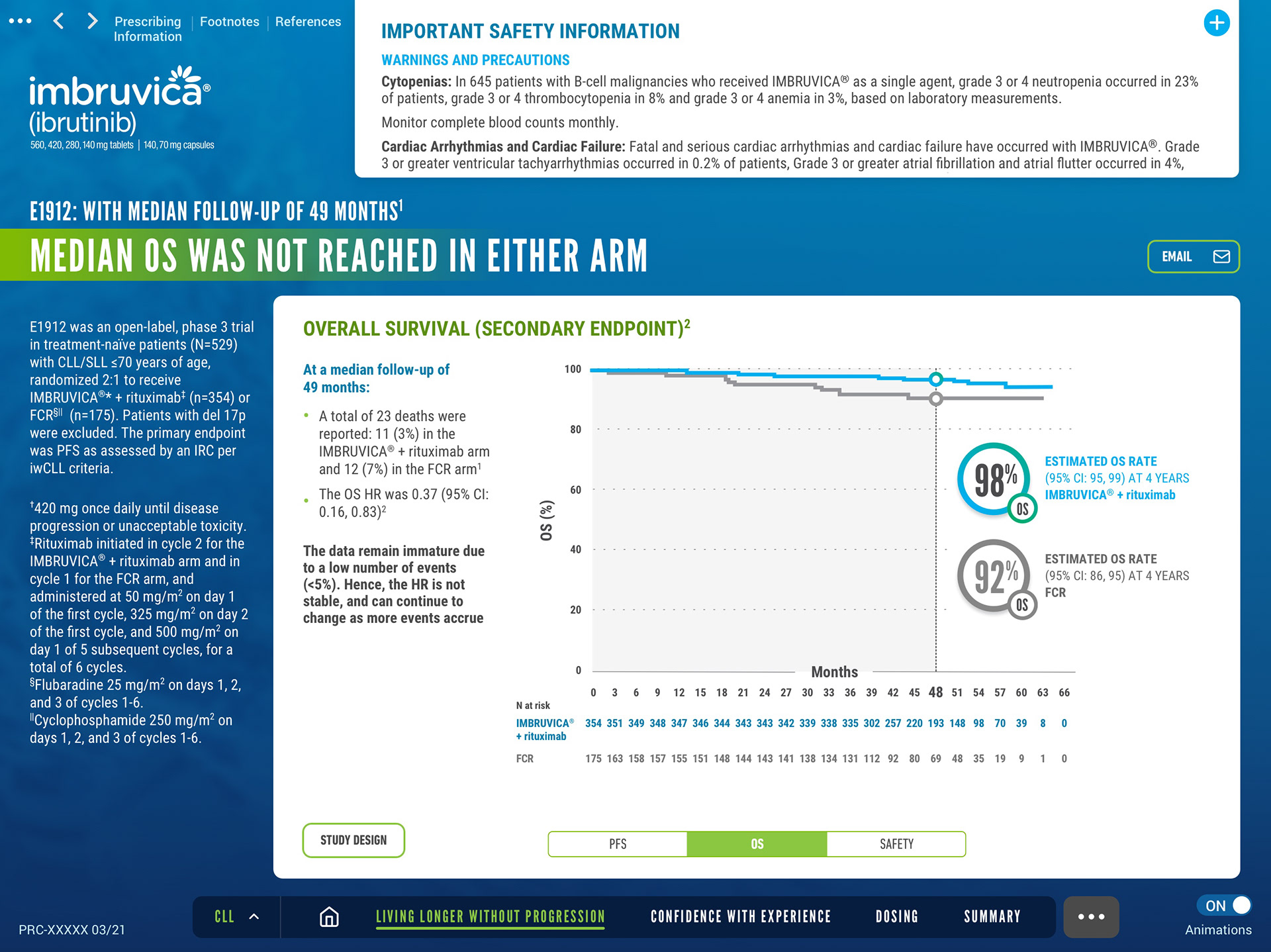
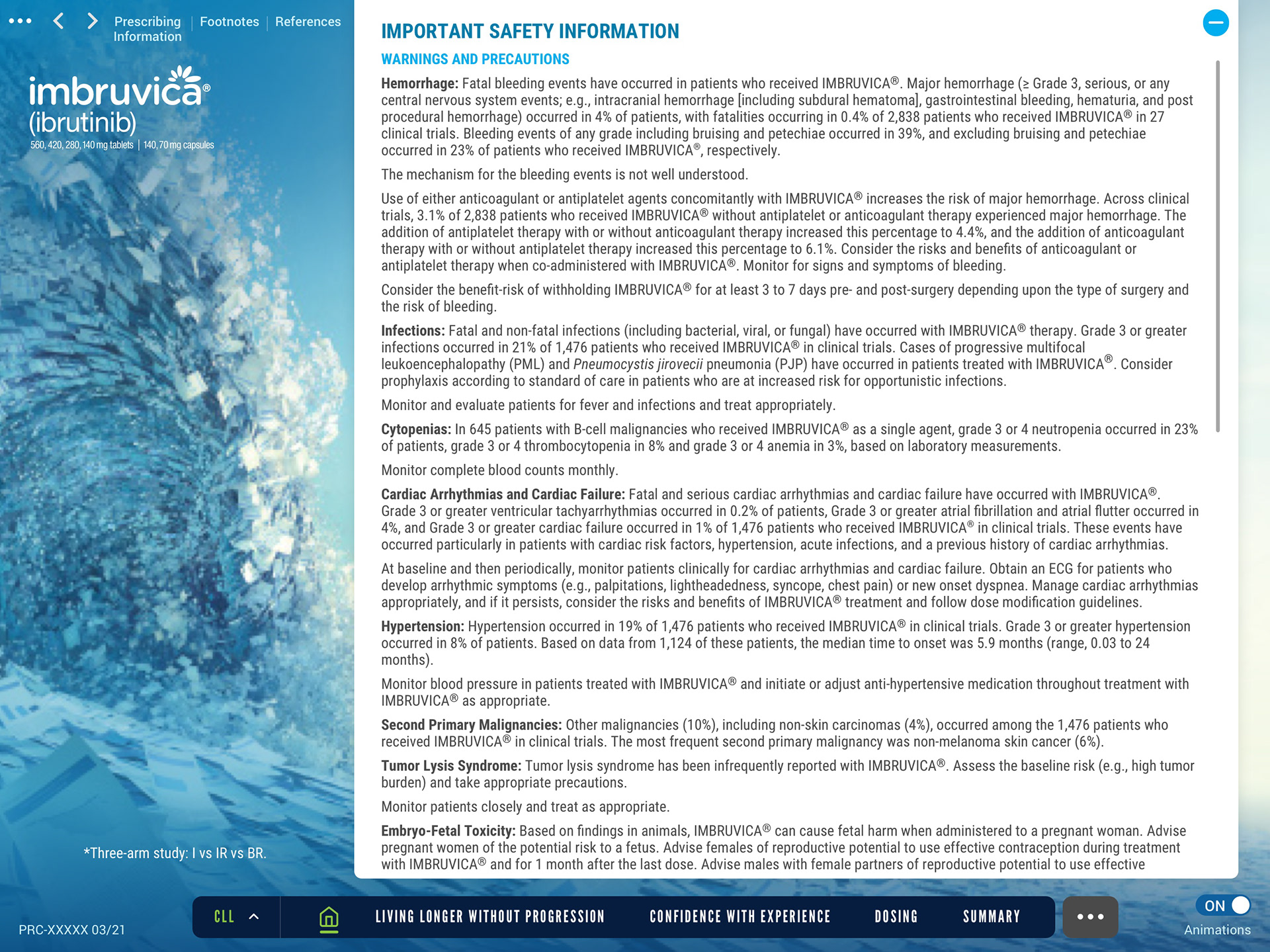
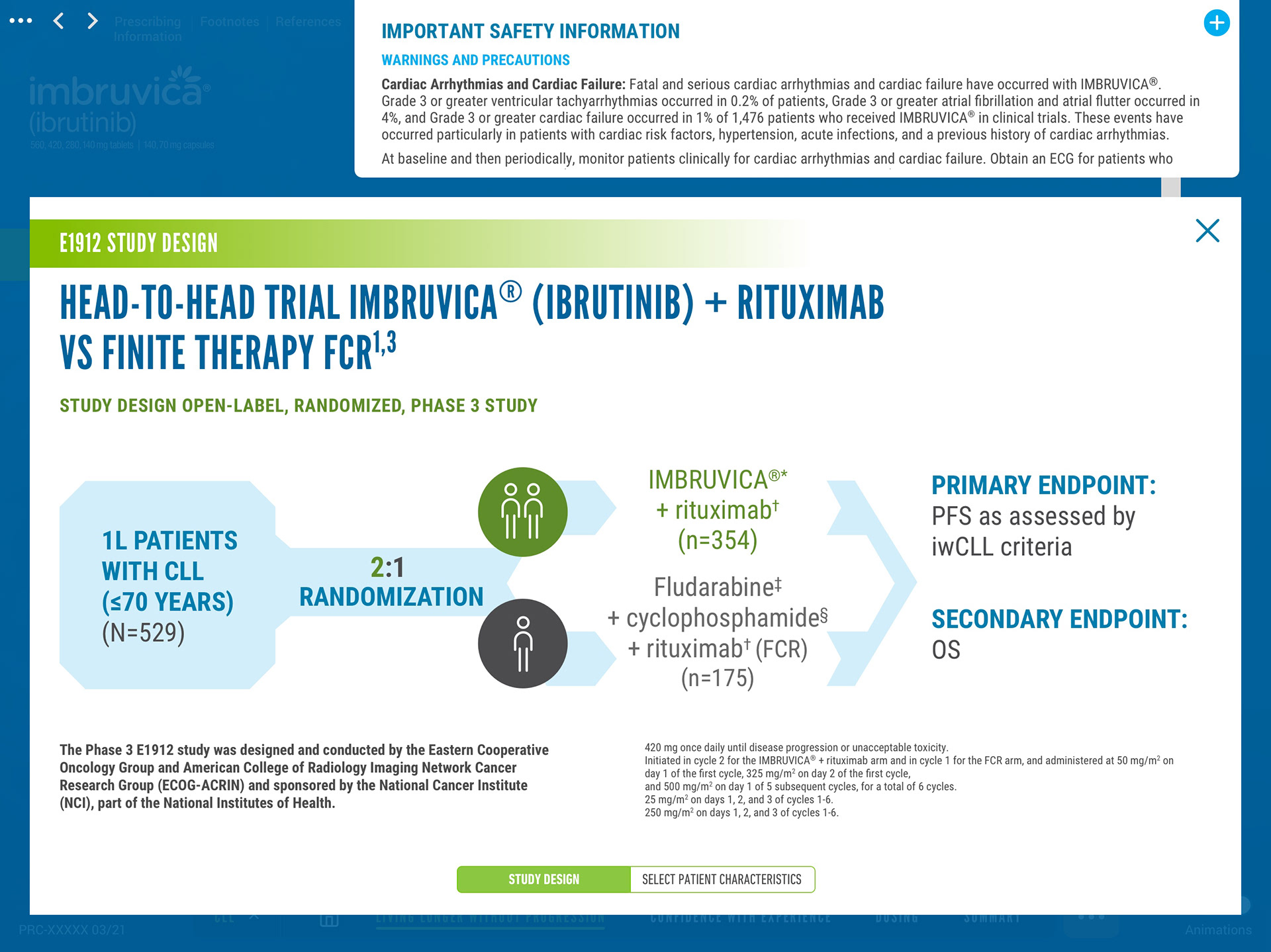
Select App Screens

Process Highlights
• Wireframe Collaboration: Partnered with the UX lead to build out navigation flows and test information hierarchy
• Design System: Created reusable UI components to handle multiple indications, ensuring consistency and scalability
• Animation & Interaction: Introduced lightweight Lottie animations to enhance transitions and reinforce key moments in the experience
• Compliance-Driven Design: Integrated Important Safety Information (ISI) as a persistent, accessible element across all screens
• Modular Expansion: After the initial Chronic Lymphocytic Leukemia (CLL) build, we expanded the system for WM, MCL, MZL, and cGVHD